How to Build a Startup Landing Page That Gets Early Signups
Rajesh P
March 30, 2026 · 6 min read
Every startup idea needs a moment of reality testing before you commit real time and money to building it. The launch page is that test. Before the product exists, before you have investors or a team, a well-built launch page that captures email addresses tells you whether real people are interested in what you're building. That signal is worth more than any amount of internal conviction.
The conventional advice is to use a dedicated landing page builder. Unbounce is $99 a month. Leadpages is $49. Instapage is $199. These are good tools for teams running paid advertising at scale who need A/B testing infrastructure. They're not the right choice for a founder validating an idea. You don't need A/B testing before you have traffic. You need a page that clearly communicates your value and captures emails. Build that from a prompt. Own it. Pay nothing month after month.
What a Launch Page Actually Needs to Do
A launch page has one job: make someone who could benefit from your product give you their email address. Every element of the page exists to support that one action. This framing lets you ruthlessly cut anything that doesn't serve that goal.
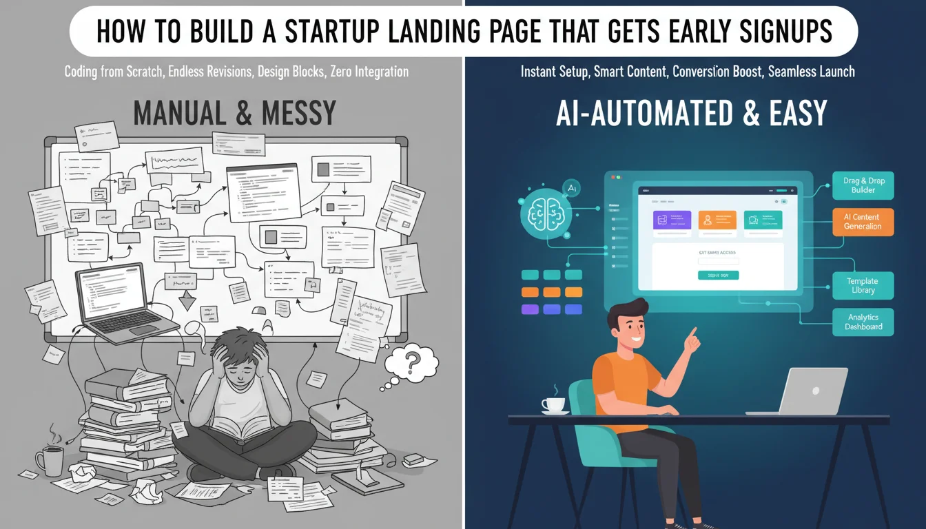
Startup Landing Page Builder
Build it with CodePup AI. Ready in 30 minutes.
What it needs: a headline that says clearly what your product does and for whom. Three to five benefits written from the customer's perspective, what changes for them, not what features you built. A primary call to action for email capture, above the fold, with a waiting list or early access frame. A secondary section with more detail for visitors who need more context. A pricing section, even if it's approximate. An FAQ section addressing the two or three most obvious objections.
The most underrated element is the pricing section. Founders hide pricing because they're unsure. Potential early users see hidden pricing as a red flag. Even 'starting at $29/month' or 'free during beta' increases conversions. It answers the question every visitor is silently asking.
Why Multi-Page Beats Single-Page for Credibility
The instinct for early-stage founders is to build a single scrolling page. Less to build, less to manage. But there's a credibility cost most founders don't account for.
When a serious visitor evaluates whether to sign up, they want to feel like they're looking at a real company building a real product. A site with a homepage, a /features page, a /pricing page, and a /faq page reads as significantly more substantial than a single scrolling page, even if the total content is identical. The navigation alone signals that this is a real thing being built.
There's an SEO benefit too. A homepage competing for one broad keyword and a /features page ranking for long-tail feature-specific searches are two different organic entry points. Single-page sites can only rank for one set of keywords. Multi-page sites compound their reach over time.
How to Write a Prompt That Generates a Real Launch Site
The prompt is the brief. Give the AI builder the same information you'd give a designer: what the product does, who it's for, what the core benefit is, what pages you need, and how you want it to look and feel. Specificity is everything.
Sample prompt: Build a launch site for Loopback, a tool that helps small agency owners collect, organise, and follow up on client feedback without losing anything in email threads. Target customers: freelance designers and 2-5 person creative agencies. Pages: homepage with hero section, benefit points, and waitlist signup form; /features page explaining how feedback collection, organisation, and follow-up work; /pricing page with a free beta tier and two paid plans ($29/month and $79/month); /faq page with 6 questions. Call to action throughout: join the waitlist, collect email addresses. Design: clean, modern, slightly editorial. Primary colour: deep slate blue. Secondary: warm off-white. No stock photos.
The One Failure That Ruins Launch Day
There's one failure mode on a launch page that's worse than any other: the email capture form that silently doesn't work.
The visitor lands on your page. They read the copy. They're interested. They enter their email and click the button. A success message appears. They close the tab. Their email was never stored, never sent to you, never captured anywhere.
This happens when the form is built as a frontend component without a properly connected backend or email service. The form looks identical whether it's wired up or not. You can only tell by submitting it and checking whether the submission was received.
If you spend two weeks getting your launch page ready, post it to Product Hunt, get 300 visitors on the first day, and your form is broken, you've lost 300 potential early users. You don't know who they were. You can't contact them. The moment is gone.
Before you announce your launch page to anyone: submit a test entry with your own email. Confirm the submission arrives wherever you configured it to go. If you can't confirm receipt, the form is broken and nothing else matters until it's fixed.
Where to Drive Your First Traffic
A launch page without traffic is a tree falling in an empty forest. Once the page is built and tested, getting early signups means showing it to the right people in the right context.
Niche communities are your first stop. Find the subreddits, Discord servers, Slack groups, and forums where your target customer hangs out. Contribute to the community first. Share your launch page when it's relevant and clearly adds value to the conversation.
Product Hunt is useful for products with a clear use case and good visual presentation. Show up on launch day. Respond to every comment.
Personal outreach converts better than any channel. Identify 20 people who are exactly your target customer and send them a personal message. Explain what you're building, why you thought of them, and ask if they'd be interested in early access. A 30 percent conversion rate on 20 personal messages is more valuable than a 1 percent conversion rate on a cold blast.
With CodePup, your launch site is built from your prompt, delivered as a multi-page site with every form tested before you see the result. Your waitlist capture works on day one. You focus on the signal, who's interested and why, not on debugging a form that should have worked from the start.
Ready to build this?
Start with a template built for your use case.
Startup Landing Page Builder
Ship your startup's first web presence today. Describe your idea and CodePup AI builds a complete landing page — hero pitch, feature highlights, waitlist signup, and pricing — tested and live in minutes.
Start building →Landing Page Builder
Create a conversion-optimised landing page in minutes. Describe your product and CodePup AI builds a complete page — hero, features, pricing, testimonials, and CTA — fully tested and ready to publish.
Start building →AI No-Code Website Builder
Build any website without writing a single line of code. CodePup AI generates production-ready websites from your prompt — complete with Stripe payments, user authentication, analytics, and event-driven emails, all tested and launch-ready.
Start building →More from the blog
Ready to build with CodePup AI?
Generate a complete, tested website or app from a single prompt.
Start Building